Innocent No More
‘Fantasy creations flitting into the real word, eretheal nymphs sipping on the vitality of youth,
Half-open eyes closed like a crescent moon, half-light camoflaging the scent of reality,
Psychedellic swirls drifting in and out of consciousness, golden highlights framing faces in the dark,
Soft girlish hands clutching at rotting roses, a paradox between innocence and death,
Salted tears in the face of manmade destuction, tribute walls boasting rebellion and justice,
Abstract paintings lined with blood, the advocates line up to take their inevitable beatings,
A small child kneeling at the symbol of death, sunken gravestone fading into obscurity’
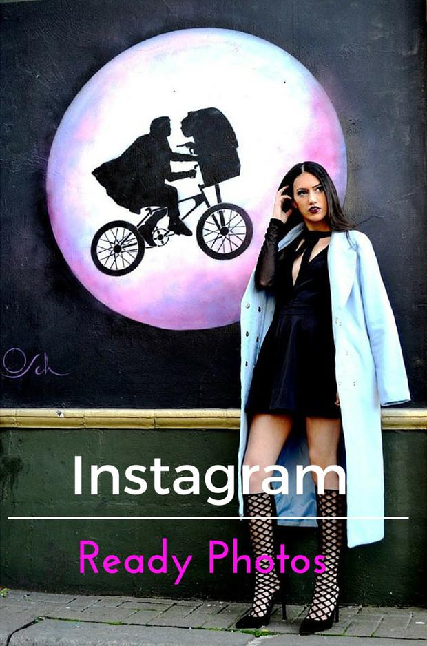
In 2016 it has become even more imperative that our Instagram feeds are picture perfect, advocating a fantasy lifestyle that rejects reality. Yet without key components such as a profound knowledge of picture composition your Instagram feed can look ‘unprofessional’ and in need of a serious makeover. Creating the perfect Instagram post has never been easier with these simple tips that can take your Instagram from drab to fab in a matter of moments.
Research
It goes without saying that creating a perfect Instagram post does not excel on creativity alone!
1.Plan your outfits/products
Remember that there is more to picture perfect posts than just ‘simple editing’ as a good Instagram post must look ‘planned’ rather than spontaneous. I reccomend using a sketchbook to jot down outfit ideas or items that have been sent for review and number them in order of which item or outfit will be photographed first.
2. Locations
The next step is to read your list of posts and figure out what locations you will be using to create your picture perfect posts. This is especially important if you have an Instagram theme and need to find a background that correlates with your brands aesthetic but more on that later. Search into google a list of location ideas and then whittle them down into top three locations. Once you have selected the locations think about the colours or tone of the products and/or items you are reviewing and that should help you decide which location will create picture perfect Instagram posts. Your location should embody your brand and stand out from the crowd. Think of a location that will make your feed unique but also reflect the ethos of your blog. Choosing random backgrounds that have no underlying narrative is very easy to spot so pick a location that actually means something to you. I chose street art because my blog is a political and social rejection of homogeneous norms which is often the ethos of street art too.
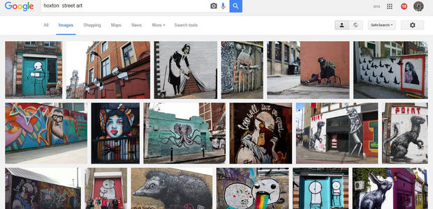
Google Search: Hoxton
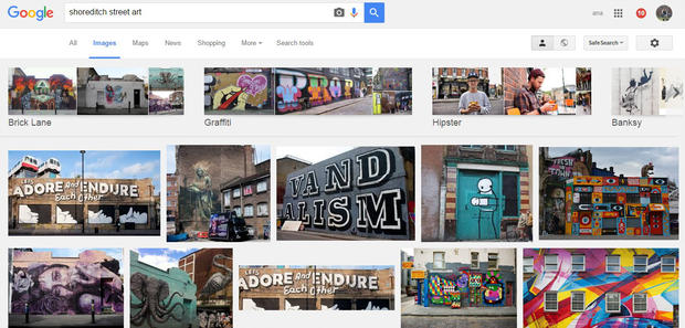
Google Search: Shoreditch
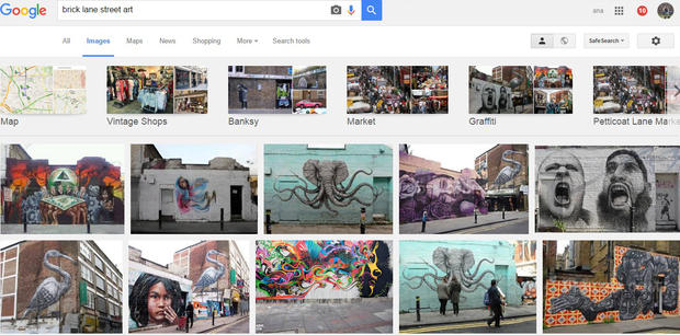
Google Search: Brick Lane
3. Match your outfit/product to your background
Remember the concept of ‘The Colour Theory’ which I explained in my post ‘Colourblocking’? Use colour theory to explore which colours will work with which background. For example in the picture below you can see that I have used a background that contains yellow and orange which compliments the tomato red and mustard yellow of the ootd. The important thing is to choose a background that is complimentary but does not blend into the product or outfit (unless that is the effect you are going for).
Full size blog photo
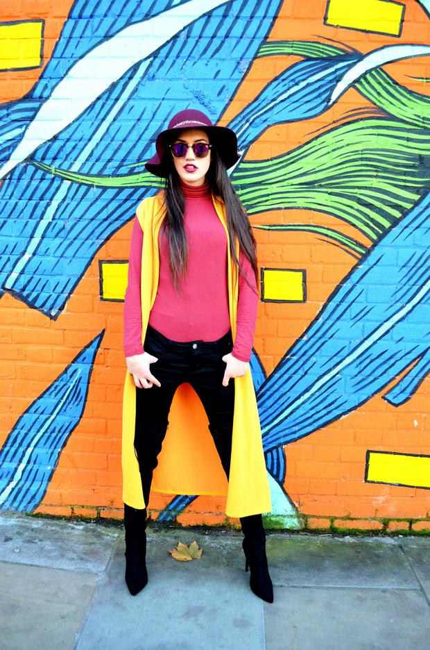
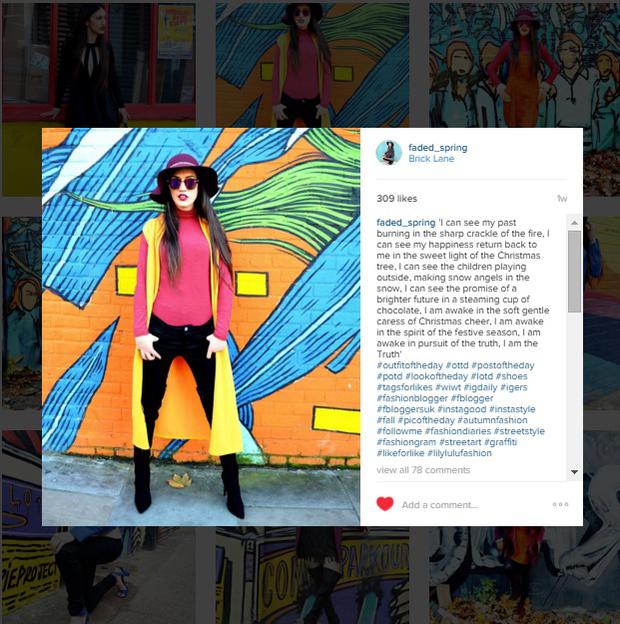
VS Instagram square format
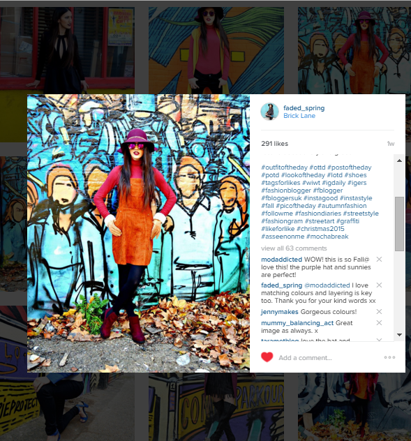
Alternatively some backgrounds do not have to match the product or outfit if it is bright or using polarising colours. As shown below the ootd uses tomato red, tan and burgundy whereas the background is predominantly blue. Because it is bright it automatically increases the vividity of the items I am reviewing which makes it a picture perfect Instagram post.
Non-Complimentary Colours Full Size
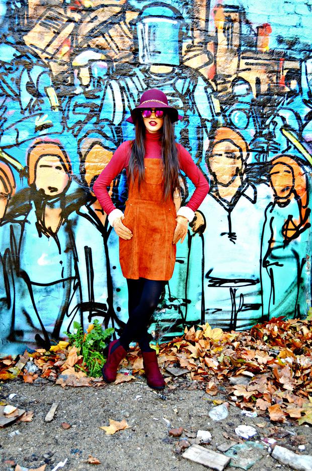
Non-Complimentary Colours Square photos
Picture Composition
Picture composition can be split into two sections: Pre-upload and Uploading onto Instagram.
Pre-upload
1. Keep it simple
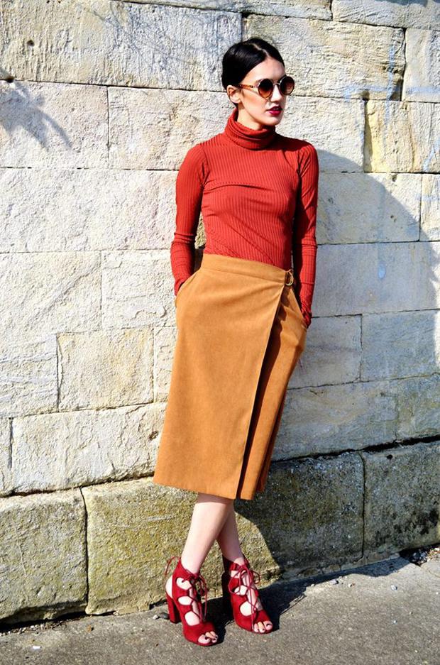
When choosing your subject select a focal length or camera viewpoint that makes it the centre of attention in the frame. Forget about the rule of thirds and create an image that is simple yet effective as over-complicating the photo will make it come across as ‘messy’.Silhouettes, textures and patterns are all devices that work quite well in simple compositions.
Simple Photo Composition
2.Fill The Frame
When shooting a large scale image it is important to not leave too much empty space in the scene, a common compositional mistake. All you need to do is either zoom or move closer to the subject creating a multi-faceted image that reflects the personality and vitality of the subject or product. By filling the frame it gets rid of ‘clutter’ and makes the subject larger.
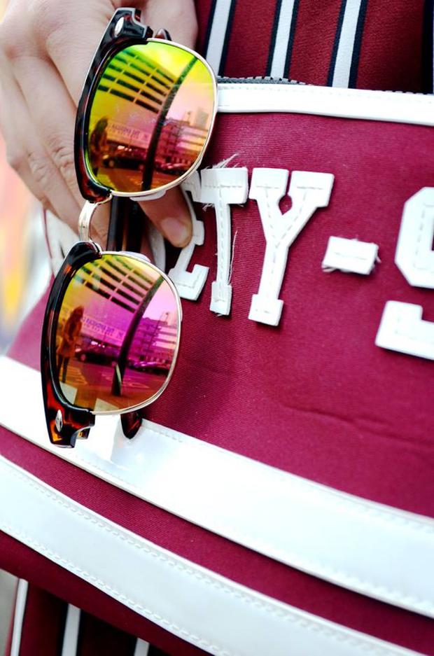
An example of how de-cluttering space can make the subject or object appear more appealing
3. Keep it straight
In most cases a straight photo is far more aesthetically appealing than one that appears distorted in the frame. Poorly composed photos will reduce a focal point and leave the viewer confused as to what is the focus of the frame. Use ‘leading’ or ‘converging’ lines to draw you into the image and as shown by the image below there is a clear line gravitating from the subject to the bottom of the photo.
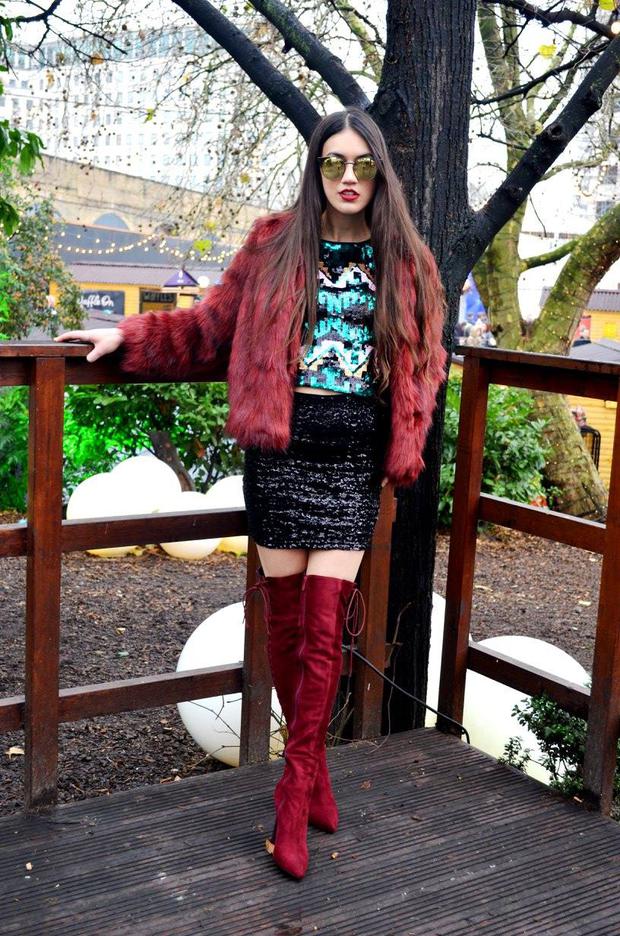
You can see the converging lines placing me in the centre of the frame
Instagram Upload
1. Centre The Photo
Traditional photography uses rule of thirds to argue against placing the subject in the centre of the frame yet the square format of Instagram photos requires it to be centered. By centering the subject you are able to structure the foreground which draws emphasis to the middle of the photo. You can do this by moving the Instagram lines to centre the photo as shown below.
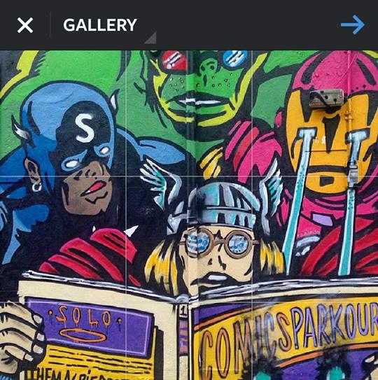
Move the lines to centre the photo
2.Use The Diagonal Principle
If there is more than one focus in the image then the diagonal principle allows two subjects to be the focal point of the frame. This balances the subjects both horizontally and vertically creating a picture perfect Instagram image. As you can see below the two subjects in the photo- me and the carousel are both subjects that are in the frame and you can see the diagonal principle line correlating between us two.
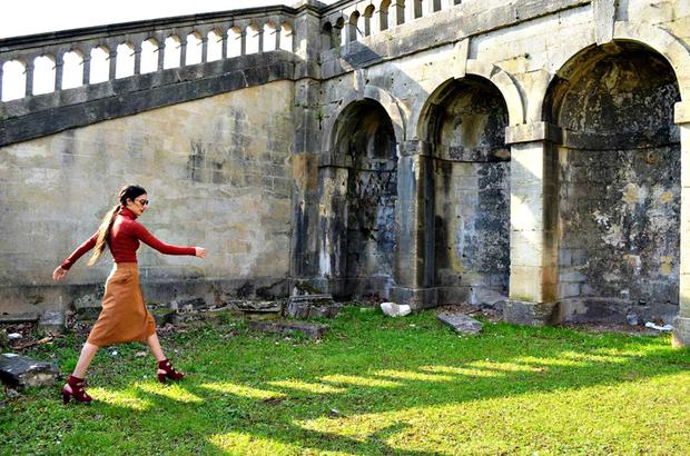
A square image suitable for Instagram that has direct lines between me at the bottom of the photo to the top of the castle.
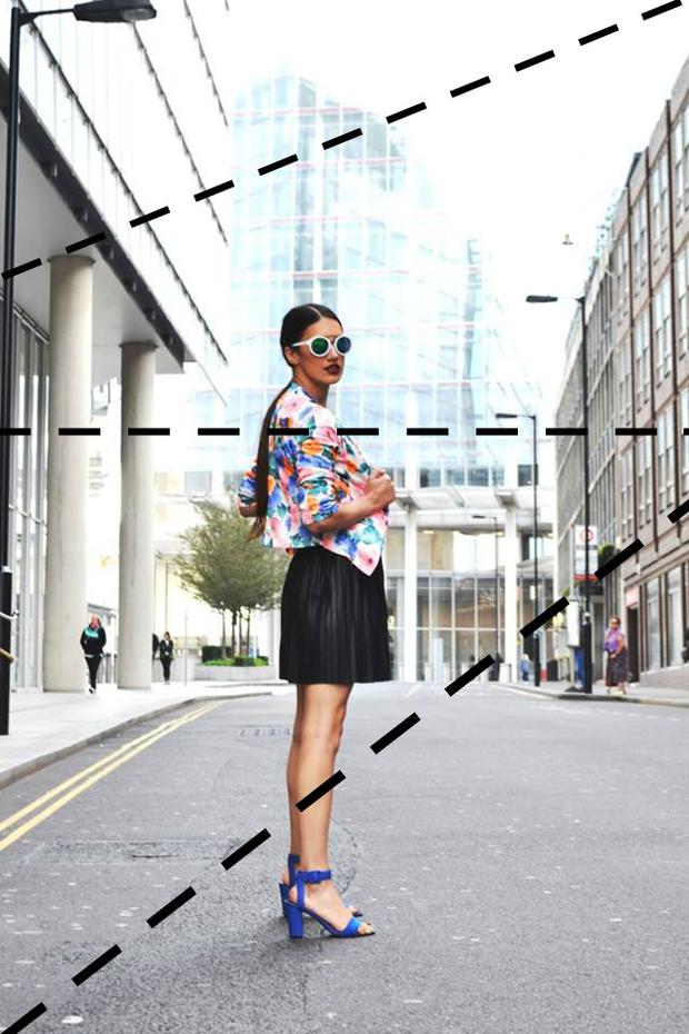
Example of the Diagonal Principle in action- notice the paralel lines between me and the skyline/buildings?
3.Shoot In Landscape Then Crop
It goes without saying that the crop tool can make any picture look ten times better. By shooting in landscape you can crop the empty space and make the subject appear more ‘vivid’ and ‘Insta-like worthy’ because the viewers eyes are immediately drawn to the subject in the frame. Although many Instagrammers use apps to create a square image it actually reduces the images pixels which can be very noticeable when you post it on Instagram. So save the de-pixellation and shoot in landscape.
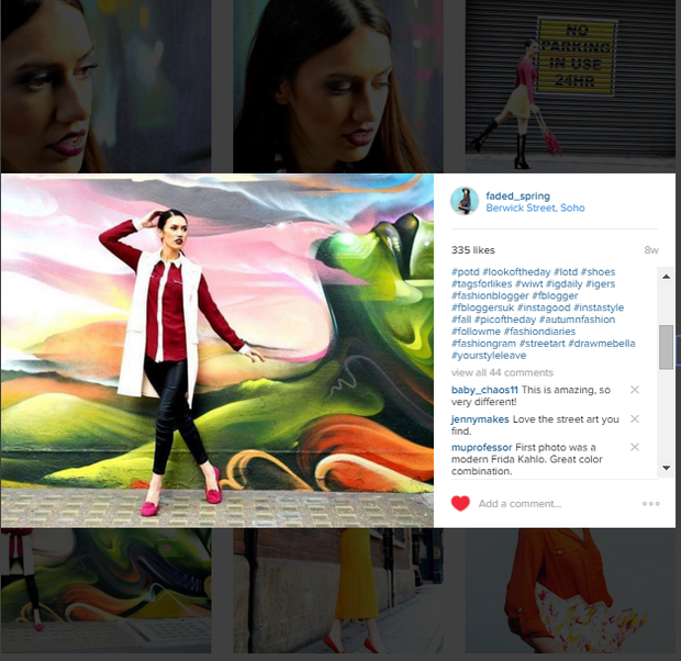
This image was originally shot in landscape before being converted into a square format
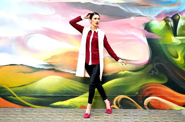
Original photo in Landscape
Filters
A picture perfect Instagram image would not be the same without a filter but be picky about what and how many filters/contrasts/ tools you use.
Picmonkey
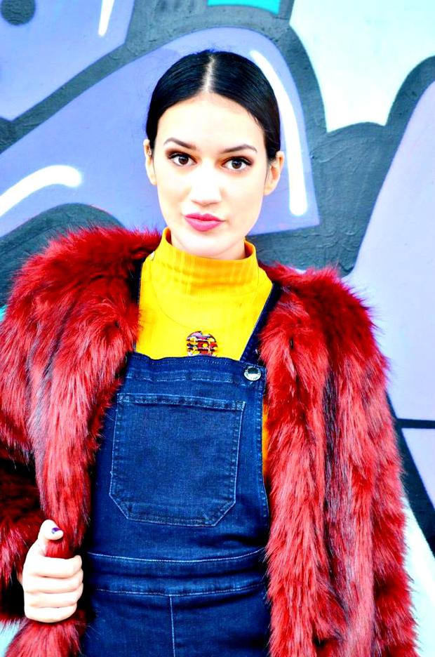
I usually edit my photos on Picmonkey and all I do is put auto-correct and crop and voila one picture perfect Instagram image. Be careful with the auto-correct feature though as sometimes it can reduce the brightness or quality of the photo. In order to know whether to use auto-correct look at the exposure of the image is slightly too bright? If it is then auto correct will make it too dark so use the filters below to add contrast and shade. However if the photo is too dark then the auto-correct feature will automatically make it brighter and accentuate the colours in the frames foreground. However there are circumstances when an image starts off too bright and becomes even brighter and vice versa as shown by the examples below.
Before Auto Correct ( Too bright and unedited)
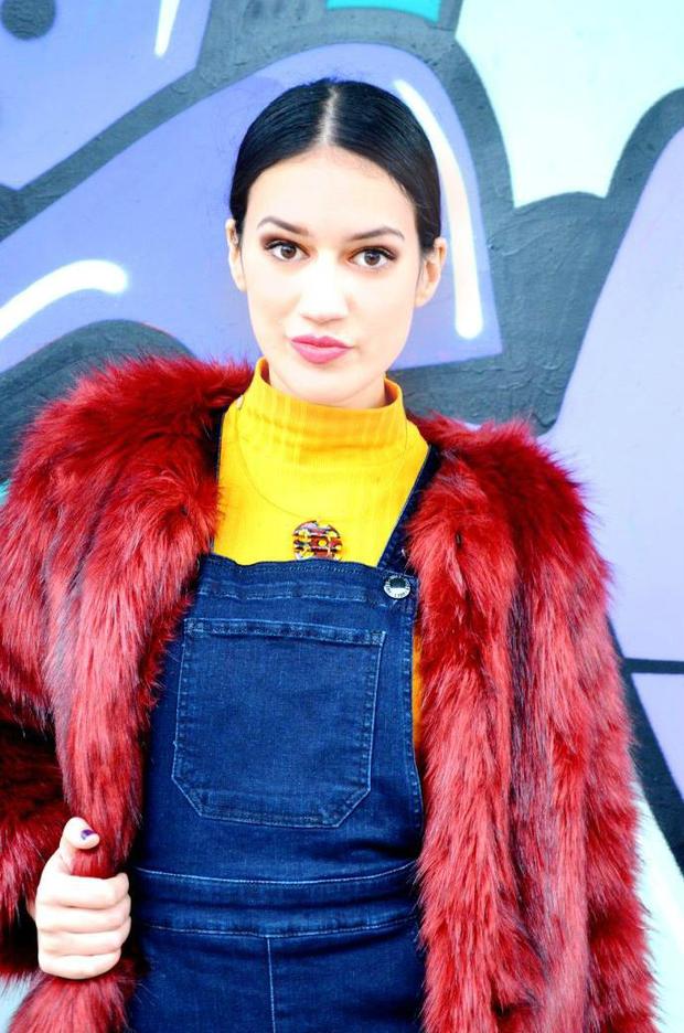
After Auto-Correct ( Still too bright but features are sharpened)
Before Autocorrect (too dark and unedited)
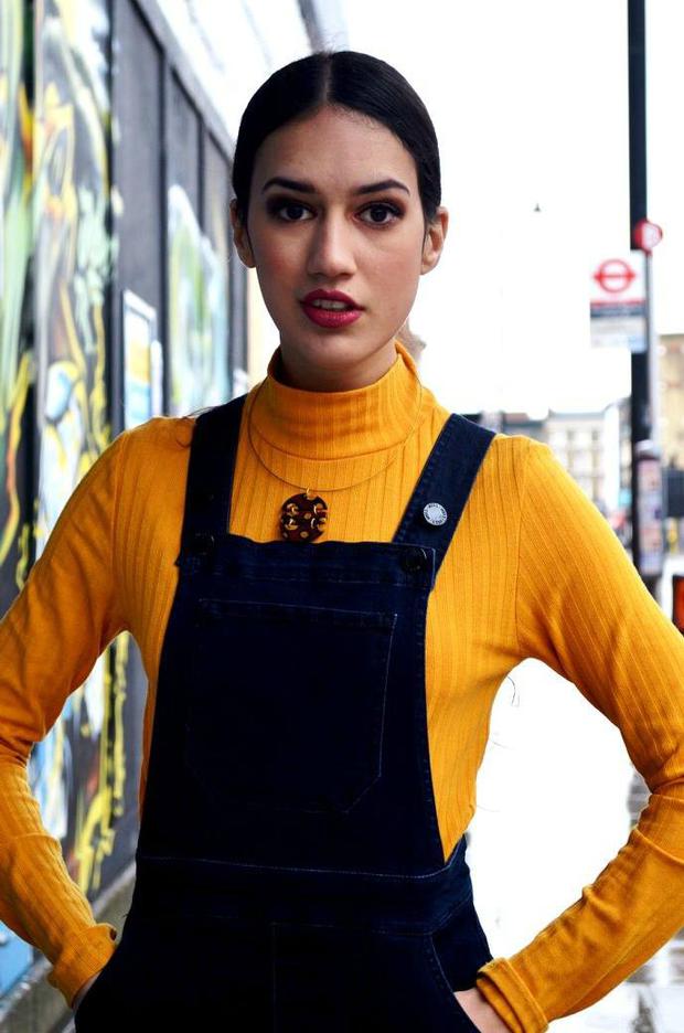
After Autocorrect ( Even Darker)

Mayfair and Valencia
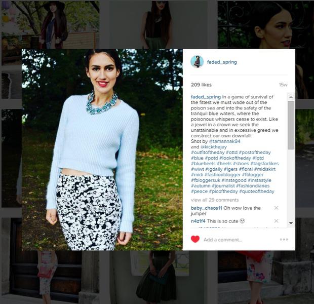
It has been scientifically proven that filtered photos are more likely to be engaged with than non-filtered photos and its top choices? Mayfair and Valencia are the most liked filters because it contains warm tones of ‘yellow’ and ‘red’ which elicit feelings of ‘arosual’ and ‘positivity’ whereas filters with bluish cool tones get the least engagement. It is best to steer clear of lo-fi because its blue-tint increases saturation rather than brightness and is subsequently associated with negative emotions. The evidence below speaks for itself.
Most liked photo contains ‘warm’ tones
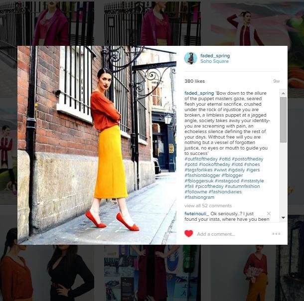
Whereas the blue tones in this photo has made it less liked and engaged with
Theme
A good Instagram post has to have a theme or ethos that correlates with the message you are trying to convey to your followers. For example a food blogger is not going to post a random picture of fashion because she is not a lifestyle blogger. Branding is key and therefore finding a consistient theme and sticking with will create a picture perfect Instagram post. Occasionally it is ok to deviate from your chosen theme just as long as the images that follow up the ‘random’ image feed into the ethos of the individual image. For example I tend to colour code my feed; when I post a photo with multiple colours in it I will use the same colour in the next few images or complimentary colours that allow my feed to flow while remaining true to my ethos.
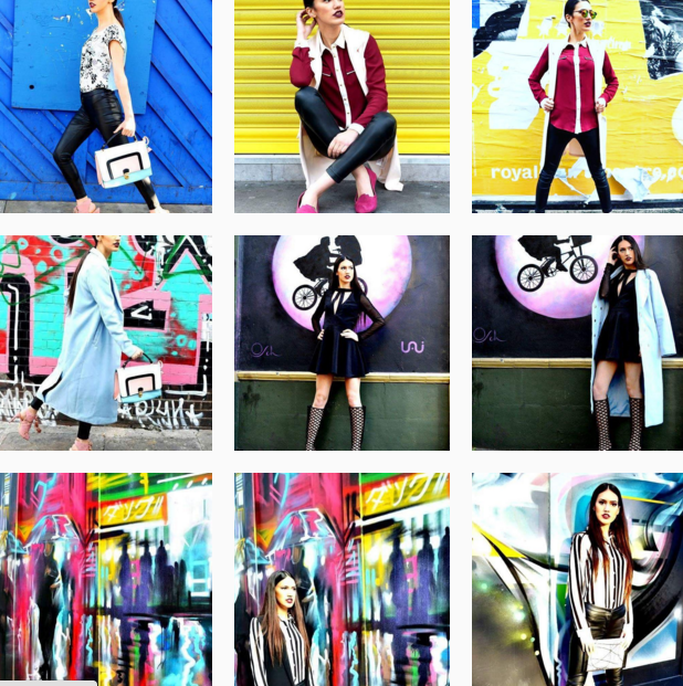
Bottom To Top: First bottom two use the same background, third photo uses the same outfit and the ice blue shown in the previous two photos, fourth and fifth use the same background, sixth uses pink and blue complimentary colours of the lilac/dusty pink and baby blue used in the previous two photos, The next three photos focus on brightly coloured walls: number seven and eight use yellow walls and the ninth uses a blue wall to bring warmth to the acidity of the previous photos.
Lighting
Avoid using the flash if possible as natural light makes the image clearer and more appealing to the naked eye. The flash will often give the image a glassy, dull coat which reduces the vividity of the image whereas natural light means you can increase or decrease brightness without pixelating the image. Finding natural light can be tricky in dark places or at night so I suggest using a phone torch or set up a light box to give the image natural light as shown below.
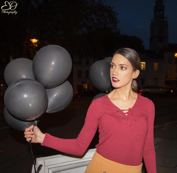
Using a Lightbox you can create a natural shot
Sizing
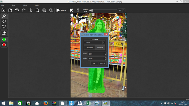
In order to create a square photo use a tool to maximise the image to 1080 x 1080 or minimize 1080 x 1080 if it is a smaller image which will have a reverse effect. I reccomend using Iresizer which allows you to create a square image with good focal composition. Jump to apps to find out how to use it.
Apps
Iresizer
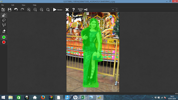
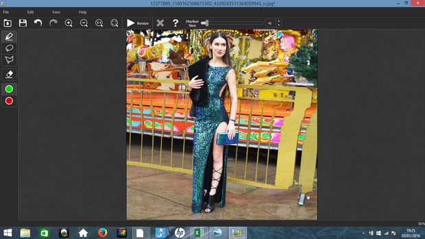
Used to create square pictures it is far better than android and Iphone apps that create square images but leave a white border which iresizer thankfully does not. All you need to do is upload, minimize 1080 x 1080 and then select the marker tool before marking the most important aspects of the image. As shown below I highlighted me which left me safe from distortion creating a square image.
Step one- Mark your focal point
Step 2- Maximise 1080 x 1080
Step 3: Completed Square Image
Picmonkey
Picmonkey is the best app for Instagram in my opinion, I use it to edit- auto, correct, crop and teeth whitening are my three most used tools on there- create collages and correct any flaws in the photo. This might be frame distortion or even using pixel dimensions to increase the pixels in the photo ( especially if the image was taken on your phone)
Unedited
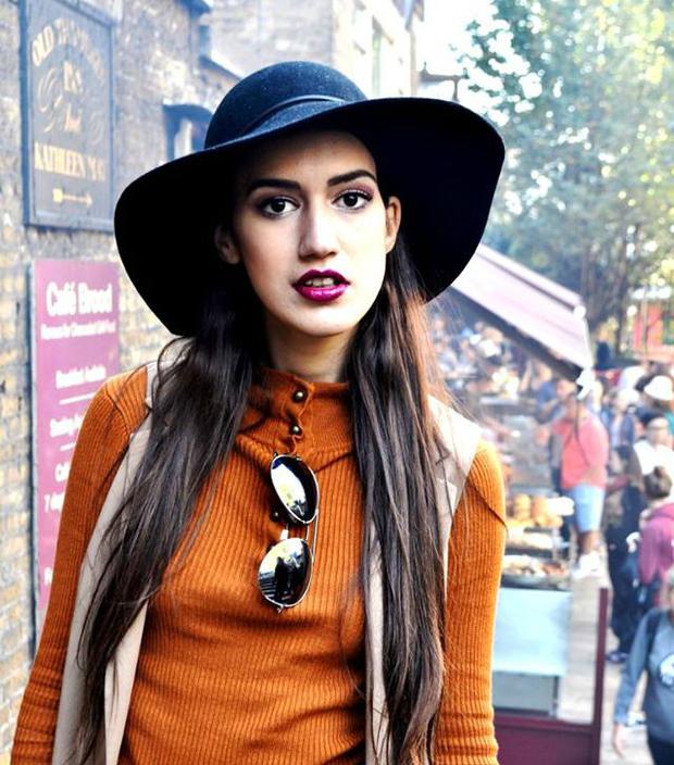
Using The Teeth Whitening Tool On Picmonkey
Whiteagram
Perfect Instagram app for IOS phones-unfortunately the android version is a knock-off version- which allows you to layer text over an image which is great if you are promoting a blog post or are posting tips which will draw the viewers attention to the photo.
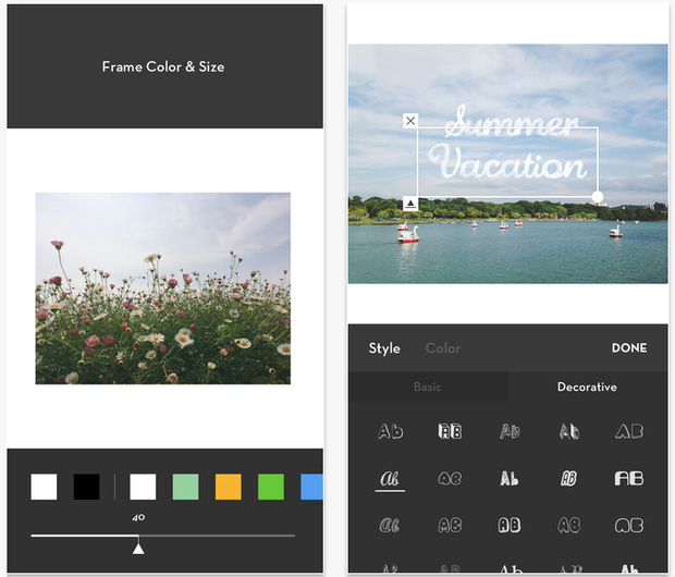
Using the text overlay feature on Whiteagram
Follow me on Instagram
Are there any more tips that you could add to this list?
Leave a Reply