‘Plums and blues dance in perfect harmony, A sensual sigh of misperfection, Colourful caresses upon scarred thighs, There is beauty in imperfection’
The origins of colour blocking
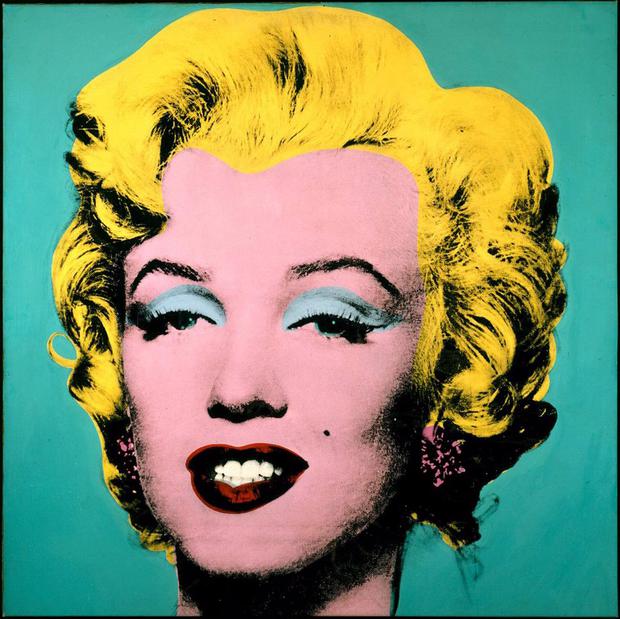
Rejecting normcore values, colour-blocking was a form of ‘avante-garde’ art centered around ‘shock value’ principles that were associated with the 1950’s Pop Art Movement.The emergence of Pop Art in the 1950s pushed America into the acceptance of vibrancy and manufactured structure, leading to the development, in the 1960s, of a fashion culture that was synonmous with colour-blocking. Teal tights were paired with orange shift dresses while frilly socks made retro culture undeniably feminine with a hint of geek chic, creating a multi-faceted look.
In the same rebellious vein as street-art, pop-art used ‘colour’ as a way to gain exposure for subliminal cultural messages that held the key to solving world issues and in a sense colour-blocking was a political expression too.Colour-blocking was about challenging gender boundaries and creating a world where rules do not define your fashion sensibilities. An ethos that the 70’s would later adopt, the rejection of social and stylistic boundaries was a way of ascertaining identity without normcore values.
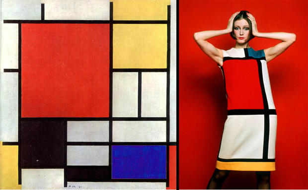
Colour-blocking like most mainstream trends was the defining point of most eras and despite its ‘tried and tested’ approach it remained ‘current’ 55 years later. One of the most popular examples of colour-blocking was the ‘Piet Mondrian-inspired dress’ designed by Yves Saint Laurent in 1965. From its early beginnings as a ‘sack-dress’ it evolved into a simple shift whose lack of angular lines and plain canvas made it the perfect background for colour-blocking.
©dejavuteam
Basic Colour Theory
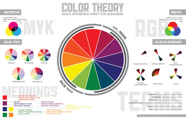
In modern culture the concept of a ‘colour theory’ defined modern colour-blocking, a process which created a logical structure for colour. Orginally developed by Isaac Newton in 1666, the modern colour wheel is split into three sub-categories: Primary, Secondary and Tertiary. The three subgroups have been used as a point of reference for colour-blocking as evidenced above by the Piet Mondrian YSL dress and remains popular to this day.
Primary
In traditional color theory (used in paint and pigments), primary colors are the 3 pigment colors that can not be mixed or formed by any combination of other colors. Blue, red and yellow make up this colour group. All other colors are derived from these 3 hues.
Secondary
Made up of Green, orange and purple these are the colors formed by mixing the primary colors.
Tertiary
These are the colors formed by mixing a primary and a secondary color. That’s why the hue is a two word name, such as blue-green, red-violet, and yellow-orange.Yellow-orange, red-orange, red-purple, blue-purple, blue-green & yellow-green are the dual colour tones that exist in this sub-group.
Colour Theory and Nature
Nature provides a perfect departure point for color harmony. In the photo below, pink, yellow, grey and purple create a harmonious design, regardless of whether this combination fits into a technical formula for color harmony.

Colour-blocking with Faded Spring
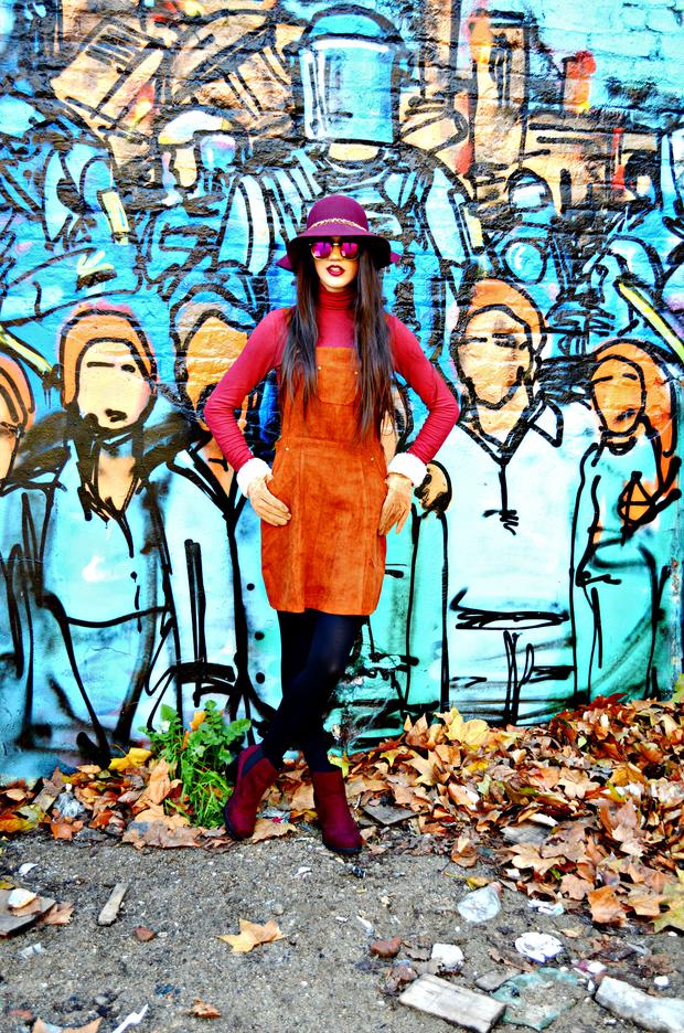
Tomato, Burgundy and Tan: Retro yet undeniably modern, colour-blocking is given a subtle makeover for 2015 and is inspired by the harmonious colour scheme of nature. The key to colour blocking using these three colours is to play around with different textures to tie into the 60’s love of mod culture. Suede is juxtaposed against nylon while leather is set against polyester.
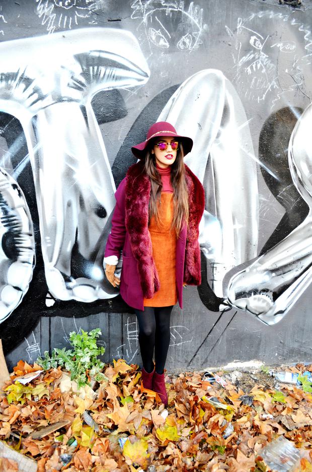
Burgundy and Tan: Inspired by the transition between autumn and winter, the rich burgundy tones are offset by tan accents synonmous with the image of fresh fallen leaves. The hint of tan offsets the jewel tones to create a luxurious but imminiently wearable transitional colour blocked look.
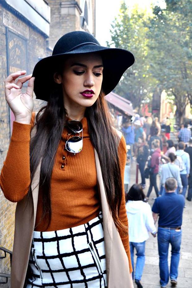
Pumpkin, Beige and Geometrics: Combining abstract art with accents inspired by nature the neutral yet warm ootd can be worn in both autumn and winter. Just add thick wooly tights and swap the sleeveless waistcoat for a burgundy duster coat and it will still create a season-appropriate colour blocked look.
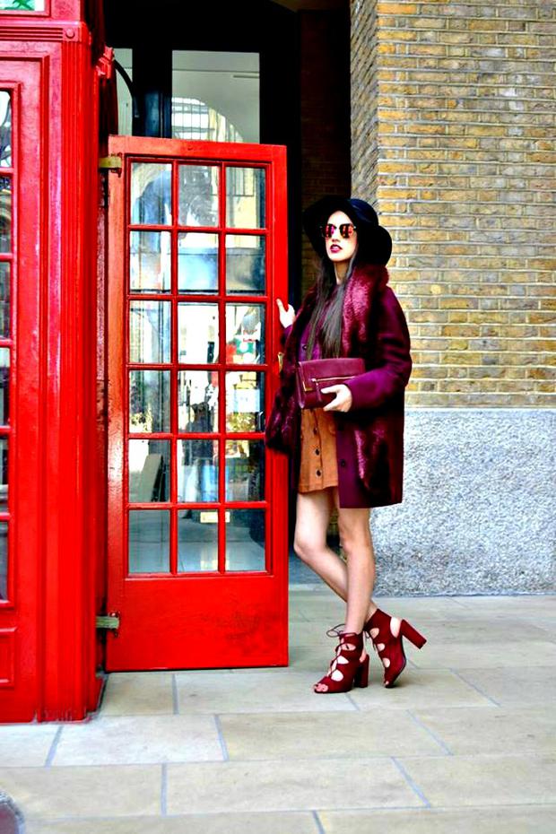
Burgundy, red, magenta and tan: Taking inspiration from jewel tones that is synonmous with party wear during the Christmas season, the warm ootd is luxurious and suited to a woman who appreciates subtle colour blocking more appropriate for the modern era.
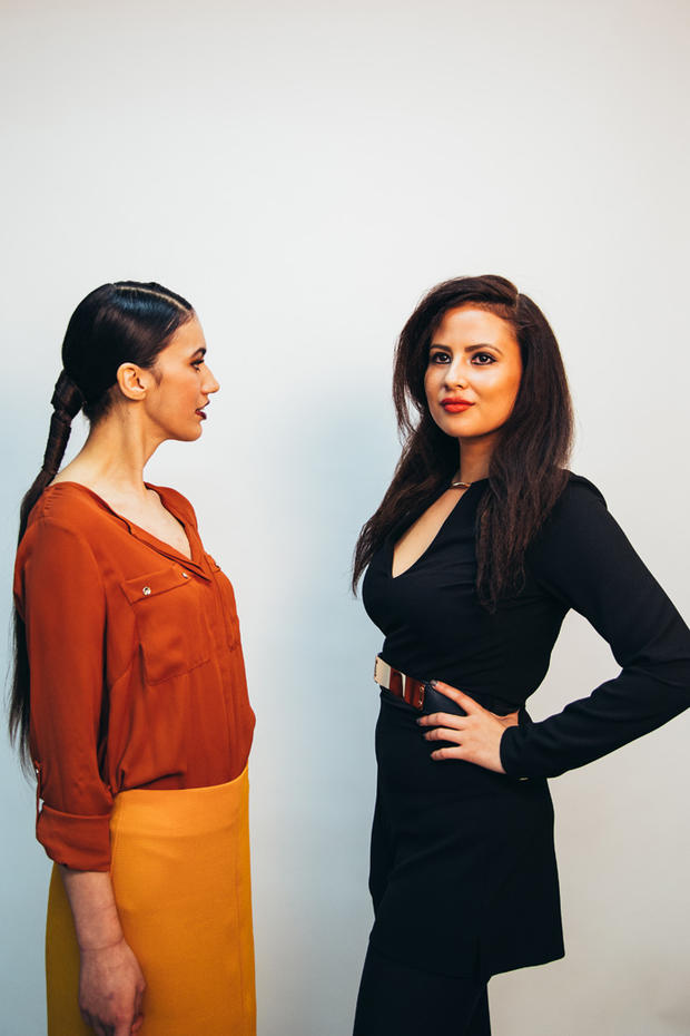
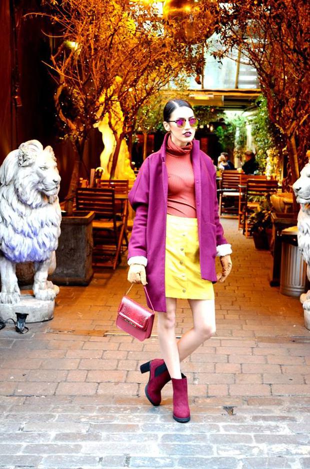
Mustard and Burgundy: Inspired by the acidic beauty of mustard the colourblocked look is retro with a modern twist. Ombre sunglasses reflect off the burgundy accents while the pop of mustard is inspired by its tangy edible appeal.
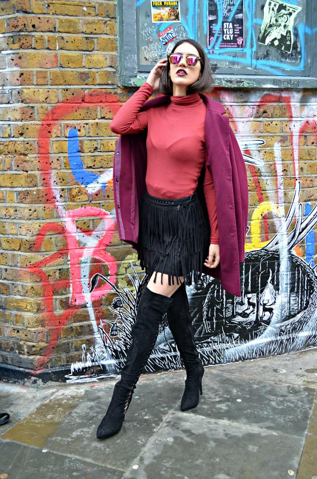
Burgundy and Rust: The key to wearing rust is to wear a colour that compliments it using basic colour theory and what better hue than burgundy to amp up the fun factor. Paired with suede rust seems more refined and enables you to stand out from the crowd.
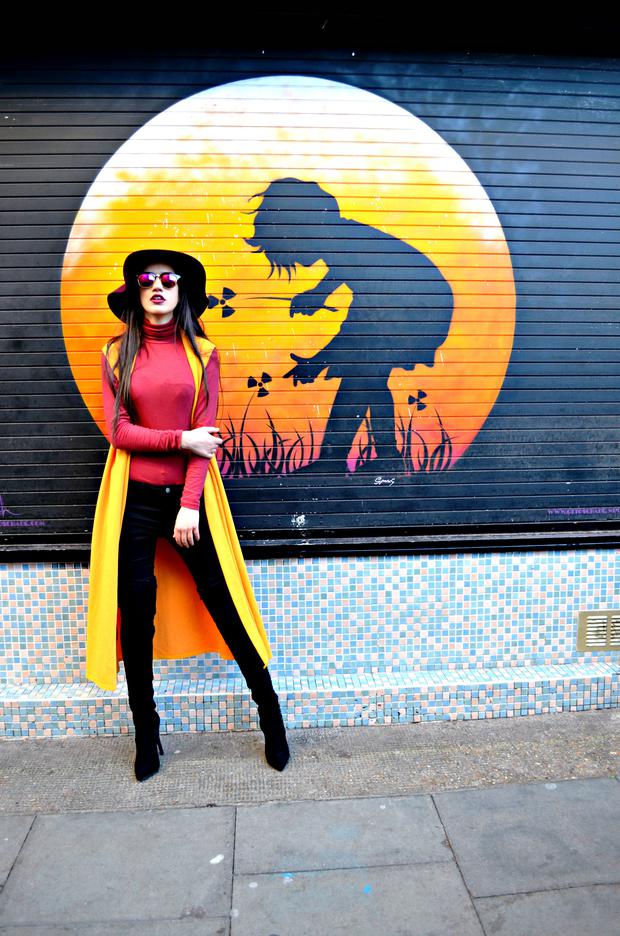
Tomato red and mustard: Can you guess what this look is inspired by? Yes you guessed none other than a standard hot dog drizzled, the irony being that I am a vegetarian. Food is a great place to start for tips on how to colour block so next time pay attention to the sauces you mix because that could be your next ootd inspiration.
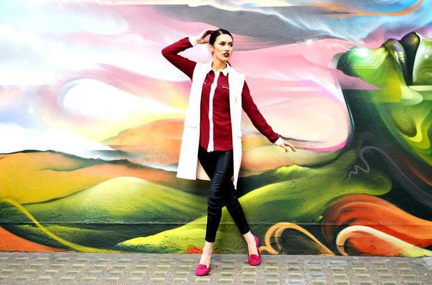
Pastel Pink, red, white and magenta: Juxtapose your colour blocked look with a pair of skinny leather trousers to off-set the sugary pastel shades. The unexpected pop of red and magenta stop it from looking too twee, giving you instant ‘street’ cred.
Do You Like to Colourblock?
Much Love Springbots xox
Photography: Jumanna Khanom
Locations: Berwick Street Soho, Brick Lane, London Bridge, Shoreditch
Leave a Reply