In today’s fast-paced digital landscape, visual marketing has become a game-changer for brands looking to captivate their audience and stand out in a crowded market. The saying “a picture is worth a thousand words” holds truer than ever, and leveraging visual elements can elevate your brand to new heights. Take it from me. I am well known not only for my unique ‘poetic’ writing style, but my colourful aesthetic too. Vibrant, colourful, personality-driven. A dopamine rush, with a clear message. Someone who always has something meaningful to say. With endless brands clamouring for consumer attention, how do you stand out from the crowd? Whether you are a creator, a small business owner, or a mainstream brand, leaving a lasting impression can be tricky. The market is saturated, so breaking through the clutter to capture your audience’s attention can be tricky. This is where the power of visual marketing strategies comes in to play. Visual content allows you to tell your brand’s story in a more engaging, and memorable way. Most of the information transmitted to our brains is visual, and visuals are processed 60,000 times faster in the brain than text. So, whether it’s video, images, data visualisations, illustrations or other graphic elements, compelling visuals have an unparalleled ability to educate, explain, excite and inspire your audience.
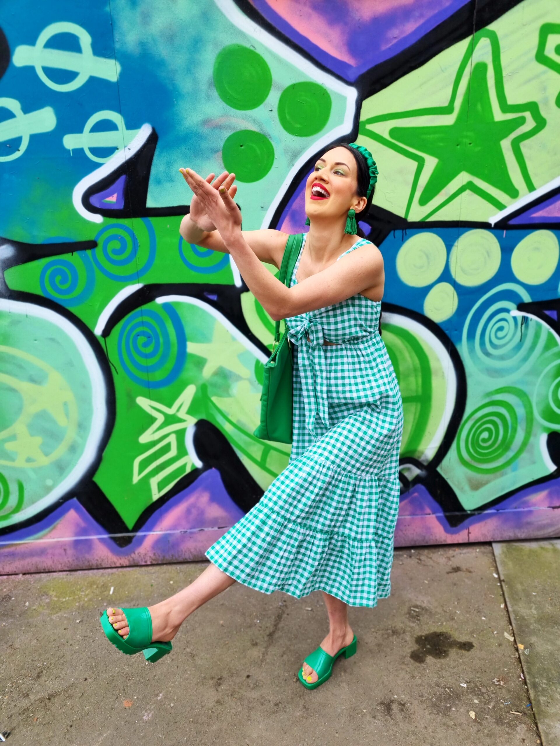
From personal experience I know how powerful visual marketing can be. I love to write with a passion. But not everyone follows me for my writing, and advice. Many of my followers connect with me because of the way I ‘create visual content’. Even when I am creating videos, feed posts, or blog photos, an image can tell a thousand stories. The beauty of aesthetics is that the interpretations are universal. It says a lot about who you are, and how you want to come across. Yet at the same time, it allows the audience to see visual content through their own lens. It might bring them joy. It might make them think. That’s why for me having a visual brand identity goes beyond aesthetics. It’s about telling a story. Think about your favourite content creator. How does their Instagram feed make you feel? Do you feel inspired when you look at their images? Does their videos take your breath away? What type of content are they creating? Do you get value from the content they are putting out? I was curious what reaction my own feed would get, and was pleasantly surprised by the answers. The most common words used to describe my content was creative, joyful, colourful, and inspiring. My content was seen as ‘entertaining’ but also value-laden. I was told I had a very distinctive aesthetic, point of view, and storytelling style.
This resonated with me because the writing comes much more naturally to me than photography, and videography. But to my audience, I have a strong aesthetic too. As a brand or creator (or both), your visual journey is important. Whether you have a blog, a magazine, a website, social media like TikTok, or a physical product, visuals increase conversion rates. Think of it this way. What you rather? A very long blog post which is insightful, has great information, and is well-written. However, it has large paragraphs, is hard to read, and no visual images. Or the same blog post, broken up with powerful images, that demonstrate what your post is trying to say? I know what I would choose. Sure, I like books without images, as many of us do. But for some reason my attention is drawn to images first before the writing online. It makes sense. When you scroll through Instagram, what do you see first? The image? Or the caption? When you start thinking like your audience, you see how you can elevate your brand. From harnessing the power of social media, to optimizing your content for visual search, here are 6 visual marketing strategies.
Create A Consistient Brand Identity
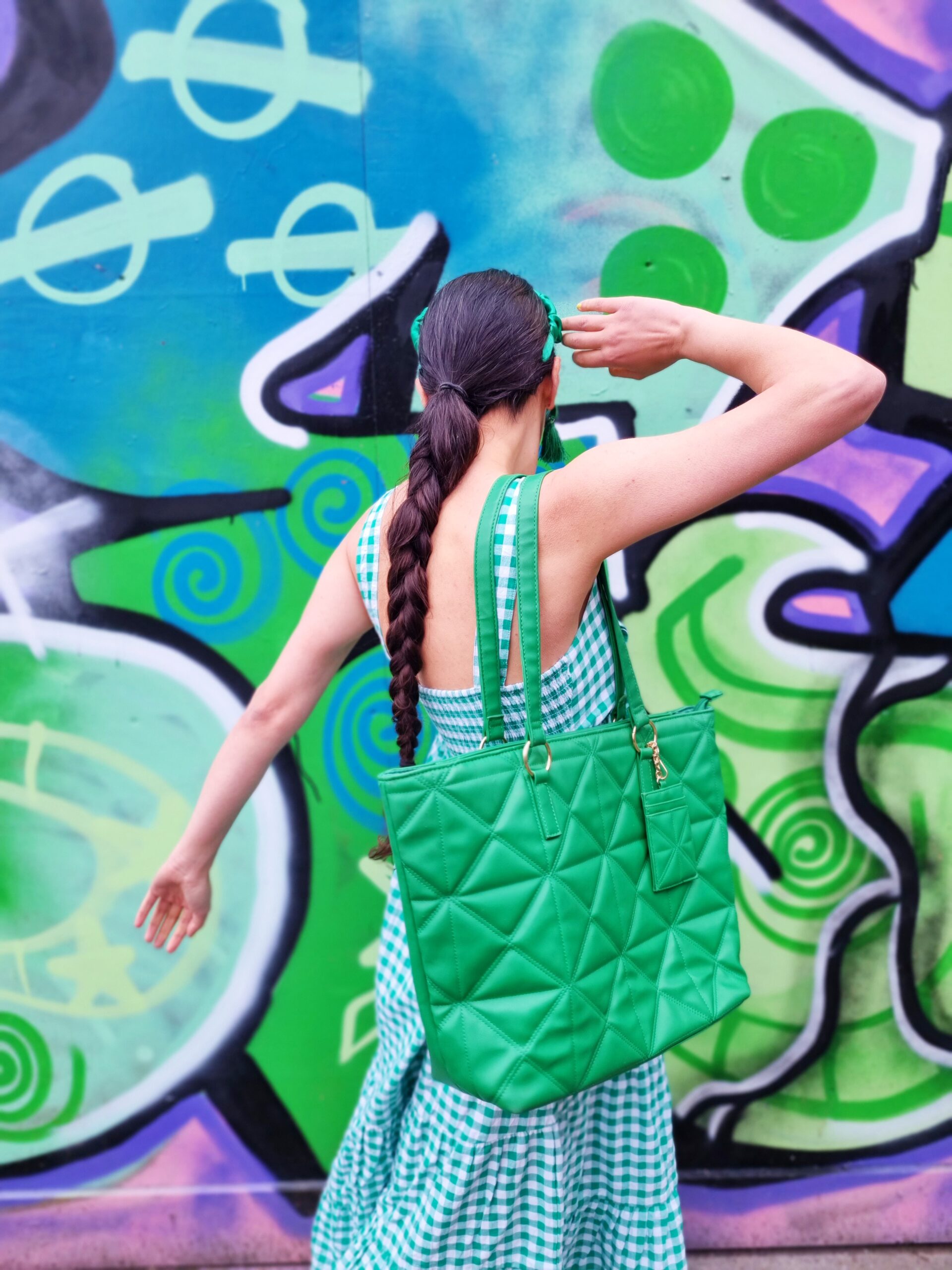
It might sound obvious but consistiency in colours, fonts and imagery help build brand recognition. It makes it easier for your audience to identify and remember your brand. For example, if I started dressing neutral, and used minimalist backgrounds, this would confuse my audience. Why? Because it is not what I am known for. I might have started off that way, but it never felt like me. Even the way I pose, is well-known. It is over-the-top, sometimes ridicolous, but always feel good. My content used to be very editorial, but it never felt authentically me. Truth is, I am a little bit silly, and that’s OK. However you want to come across, make it personal to you or your brand. Think of who you want your target audience to be, and what preferences they may have. It is important to create content/ a product/ a message for yourself of course. But if you want to grow your brand, you need to put your customer or follower first. I do this by evaluating what resonates with my audience, and what dosen’t. The more saves I say, the more I try and replicate the same content. I regularly ask my audience what they would like to see from me, and reply to every dm (albeit slowly). It also important to show your audience what you offer. Whether that is infographics, videos, or animation, use visual marketing strategies to boost your prescence.
Harness The Power Of Social Media
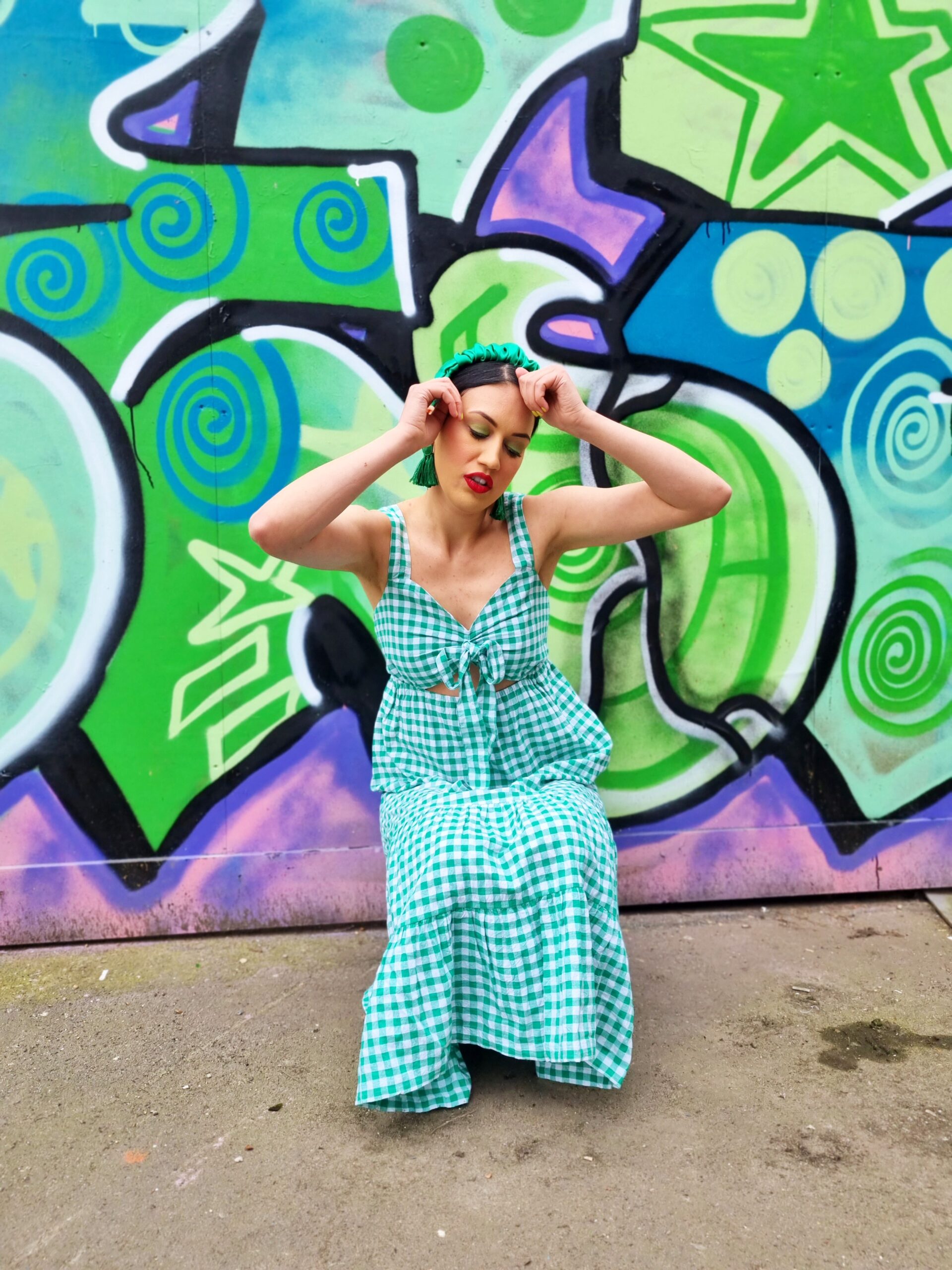
When we think of visual marketing strategies, one of the biggest players is social media. It has not only changed the way we access information, but also tranformed how we communicate too. We connect with our audience visually. Whether it is using emojis to comment on people’s posts, screenshotting clothing we like online, or sharing videos we like, visuals are everything. After all, 92% of marketers say visual assets like photos and videos are essential for their social media marketing. Visuals drive up likes, comments, shares and follows across all platforms. If you are a brand who is ‘selling products’ like clothes, art, courses or anything else, it can also drive sales. The beauty of creating content for social media, is that you can generally cross-promote the same video or photo across different platforms. For example a video you use for Instagram, can also be posted on TikTok. A photo you use on Facebook, can be repurposed for Pinterest. Whether you are telling the journey of your brand, showing behind the scenes, sharing success stories or flops, visuals can connect with your audience on a personal level. It will help retain follower/ customer loyalty, get customer feedback, and increase your reach. For brands, it might propel your business to international markets. For creators (who I see as having a personal brand), it can increase the number of eyeballs on your page.
Optimize Your Content For Visual Search
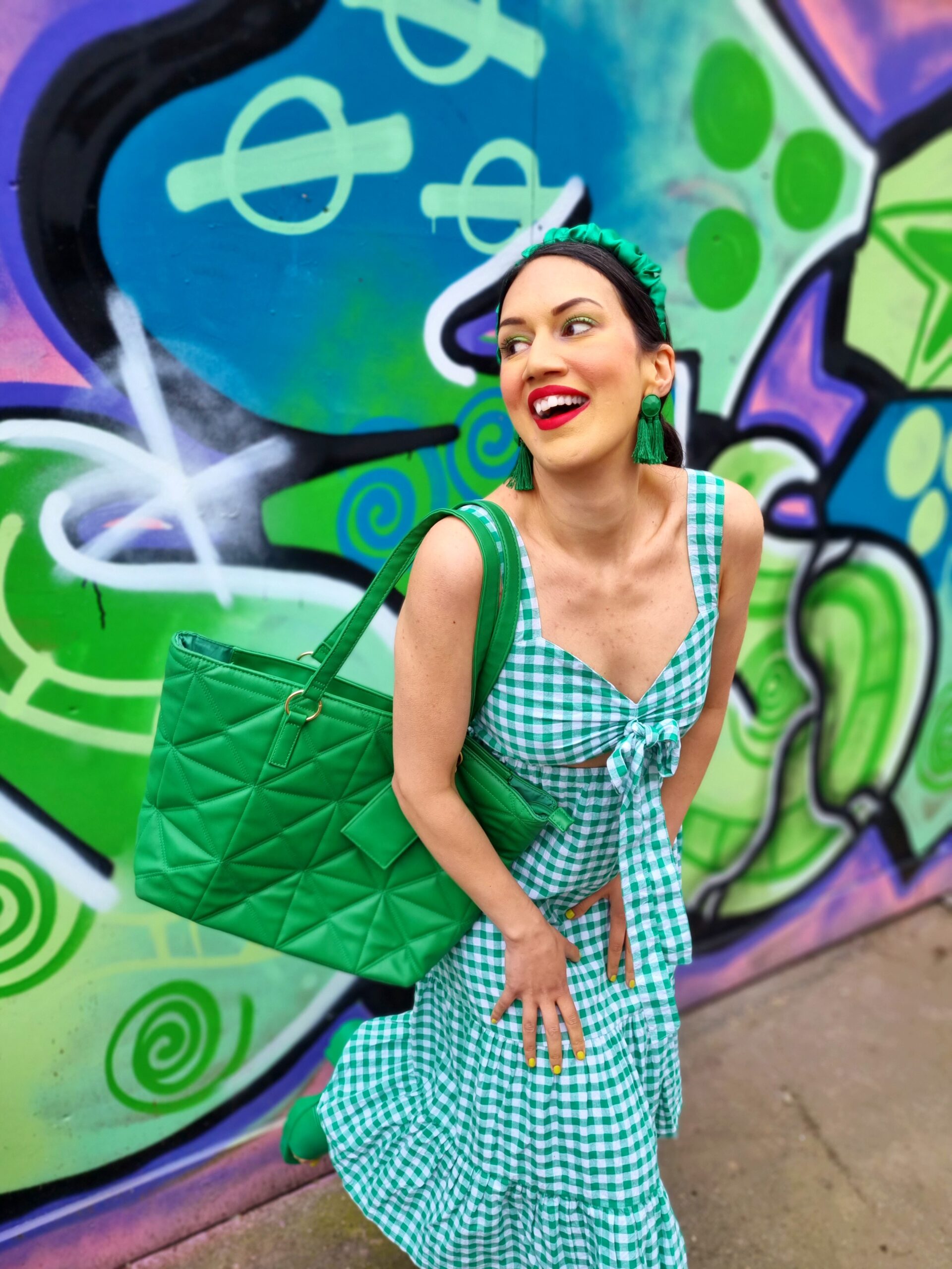
Whether you have a blog, a Pinterest page, clothing website or workshop course, visual SEO is crucial. If you are creating a blog post, Relevant imagery enhances SEO by drawing search engines to your quality content. Use alt text to describe your image, and include a description and caption too. Make sure your title describes what the image is too. For example let’s say I am describing myself in a particular outfit. The title might be ‘Ana Dancing In Blue Rodeo Trousers’. The Alt Text would be <img src=”ana dancing.jpg” alt=”ana dancing in blue rodeo trousers”/>. The description might be Faded Spring Ana dancing in Blue Rodeo trousers in Shoreditch. She is wearing a matching corset top, with a pink rhinestoned cowgirl hat. She has baby pink cowboy boots with one leg in the air, and is laughing. The coord is from Easy Shop Tiger, as is the hat. She is dancing next to a pink and blue graffited wall. The caption would be related to the content of the blog post. So for example if the blog post was on colourful fashion brands, it might read as ‘Shop Easy Tiger is a colourful small business who creates showstopping clothes, and accessories. This look is inspired by the Cowgirl trend meets Beyonce Rennaisance era Part II, and Taylor Swift. For social media it depends on the page. For Instagram, on videos use bright, readable text to make your videos accessible. If you are talking in the video turn captions on. If you are posting feed photos, make sure your caption is accessible, and describe the images. For Pinterest, make sure you have a font size that people can read, and use appropriate colours. Make sure your Pins can be accessed easily via screen readers. After all, one of the most important visual marketing strategies is to is to create content that is INCLUSIVE.
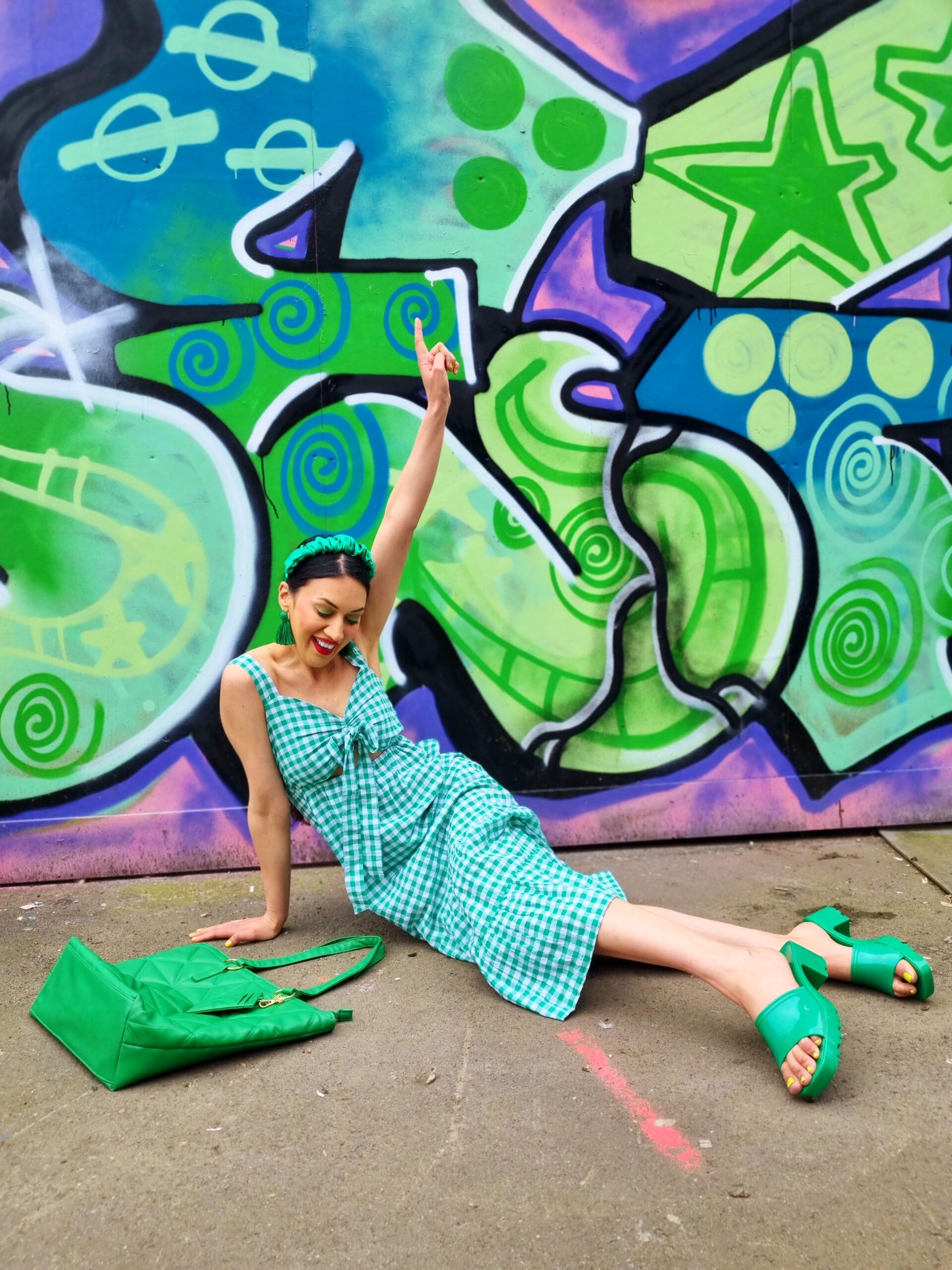
Improve Your Landing Pages
Your landing page is a great way of using visual marketing strategies to grow your brand. Make sure your website is not cluttered, and has a clear design. Create a logo that stands out, and make sure images that you use are high quality. Keep text to a minimum on your landing page, but enough to attract attention. After all, visuals on landing pages can increase conversion rates by up to 400%. Most people think of CTA’s as a tagline to draw people in. However, your aesthetics can be a CTA too. If you are a clothing brand, and have released a new product, you would want a NEW IN page showcasing that. If you are a creator, and have a blog, you want your newest posts to be shown first. Or if you are an educator, you would like services and testimonials to be on the first page. By using illustrations, photos, and colour schemes, you can deliver an engaging customer experience. This persuades visitors to convert, and come back for more. Make sure you create new visual content regularly to continually optimise conversion performance. It will help you understand what works and what dosen’t. Remember, consistiency is key, and your landing page should reflect that. Make it interesting, make it useful, make it clear. From a personal point of view, I would also say to keep ads to a minimum. Why? Because it can feel intrusive to have ads come up before you have even accessed the landing page. Sure, on a brand website, a pop up with a discount code is great at referrals. However targeted ads no matter how great they are, can get annoying.
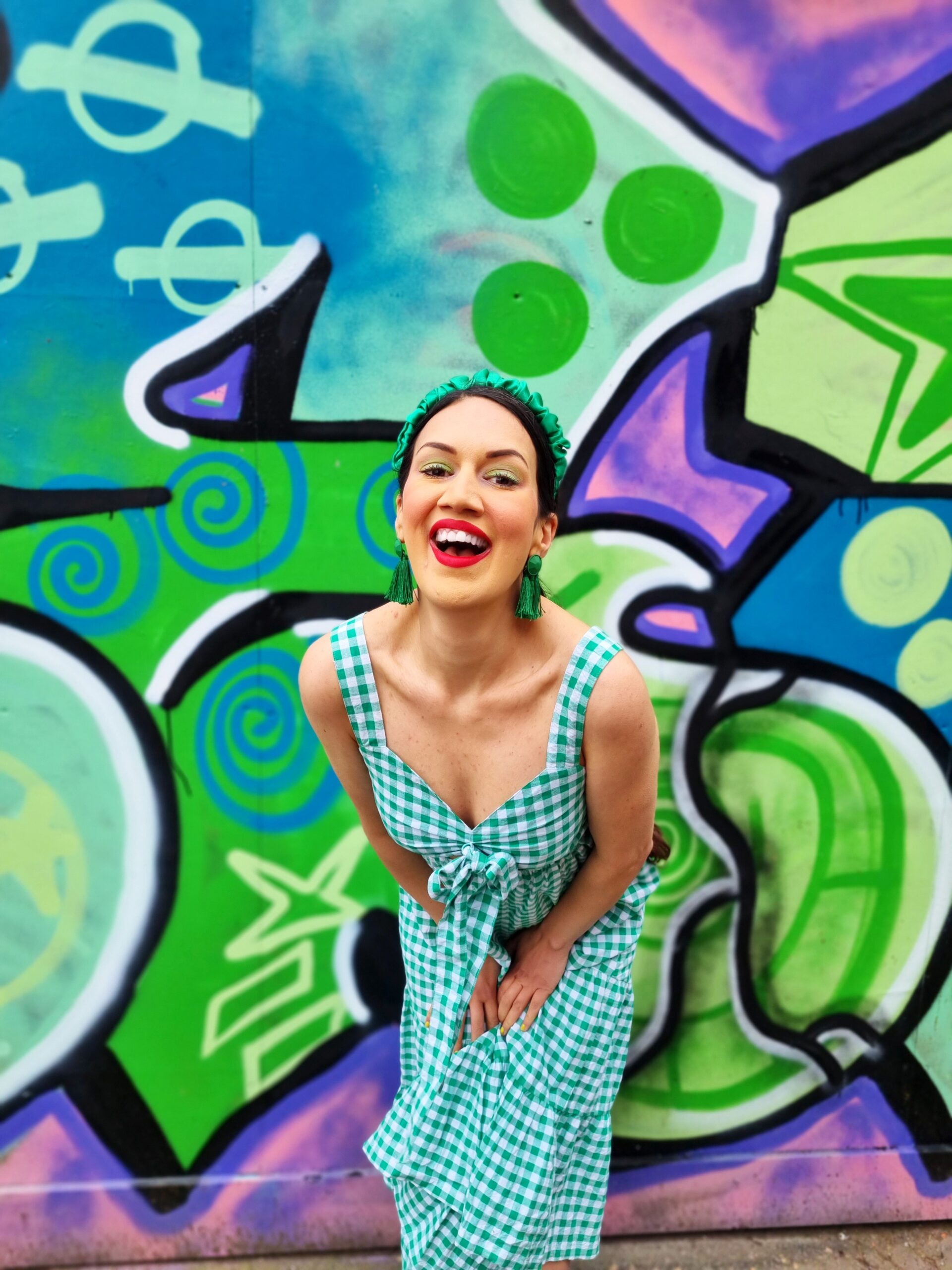
Add Visual Interest To Your Emails
Whenever we think of visuals, we think of websites, social media, and physical products. However, your emails are just as important.Visual elements in emails can increase click-through rates by over 200%. Whether you add images, gifs, emojis, banners, or videos, your aesthetics can boost engagement. Visually, to read a newsletter, I am drawn first by the colours. For example if it is contrasting complementary colours, you will want to find out more. If it has unique graphic design, you might continue as a subscriber, to see what happens next. The images and videos are important too. If I am signed up to a creator’s newsletter, I want to see the latest posts. If I have signed up to a new brand, their newsletter needs to show what cool products they have. As humans, our attention span is shorter than ever. So we need emails that use sign-up flows, newsletters, and promotions in a visually appealling way. The most powerful way to add visual interest to your emails? Repetition in art which is a powerful way to make your marketing stand out. For example, that could be repeating colours that are associated with your brand. Using typography that is personal to your brand. Taglines that are highlighted in a unique way. The way you write, but done visually. In my case, if I am sending out a newsletter which advertises my latest post, the design elements will be the same every week, unless I have a rebrand.
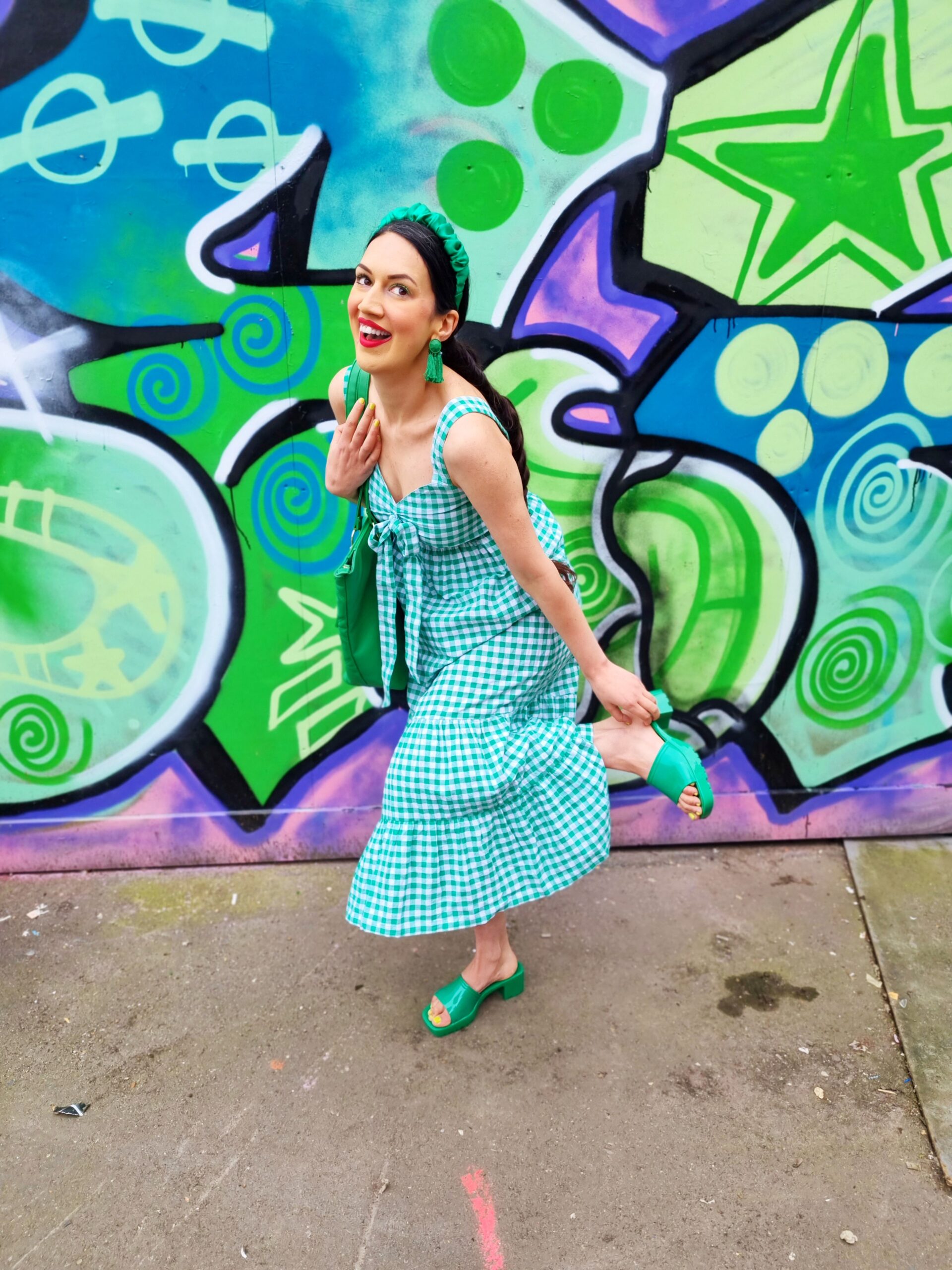
Keep An Eye On Your Visual Analytics
I said earlier about how I look at the best-performing Instagram posts to see what my audience does and dosen’t like. It helps me create content that is audience-led, while staying true to myself. If I look at my most viewed video, it shows a rainbow walk of different outfits, from blue and yellow to red and silver. It is colourful, personality-driven, and is entertaining but still useful. It gives my audience ideas on how to dress for themselves, which is emphasized by the caption. This made me realize that my audience wants to see more clothing walk videos, with unique colour combinations. However, ironically my most saved video is one of the least viewed. It hasn’t reached many accounts, but the saves show it resonated with my audience the most. And that’s important too. It is about using visuals not to go viral, but to create content that your audience loves. This video showed quirky poses you could do in a dress. They found it helpful because people finding posing in a dress challenging. It was entertaining, and solved a dilemna. Then, if I look at my most saved Instagram post (static), it is me in a sequin red jumpsuit with my leg in the air. I have disco balls as a prop, and its colourful, playful, and unusual. Every week, I see which visuals resonate the most, the platforms that perform best, and the demographics that are engaging with my content. By using these insights, it helps me refine and optimize my visual strategy. On my blog, it is a little different. I see that people tend to respond better to posts using blue, and green images. I find that posts that have more images perform better, while keywords help drive content too.
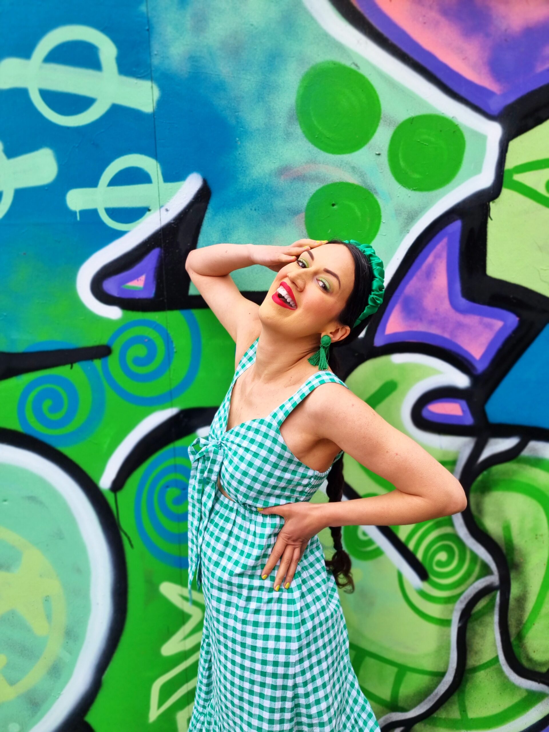
What Visual Marketing Strategies Do You Use To Elevate Your Brand?
*Disclaimer
Please note this is a collaborative post but all thoughts are my own and are not affected by monetary compensation.
Leave a Reply